Find designers
Designer search
Quickly find your next designer
Post a job
The #1 job board for design talent
Inspiration
Courses
UX Diploma
Learn UX design from scratch in 6 months
UI Certificate
12-week UI skill building for designers
Live interactive workshops
with design professionals
Jobs
Go Pro
Log in
Dribbble: the community for graphic design
Log in
Sign up
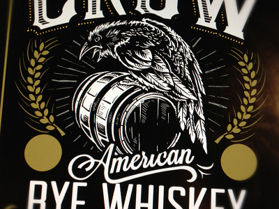
Crooked Crow - Inking
Derrick Castle
Follow
Following
Like
#100E0B
#EAEAE3
#5A4F3E
#9C8539
#AFACA6
#778287
#8D7743
Download color palette
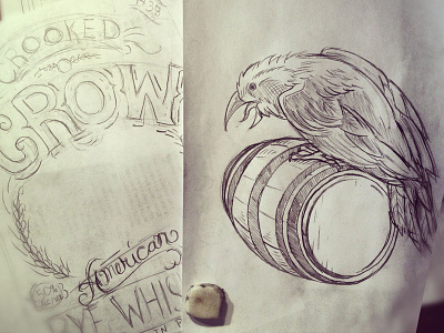
Thanks for all that tuned in for the live broadcast. This is the progress on the project thus far.
Rebound of
Crooked Crow - Rye Whiskey Sketch
By
Derrick Castle
americana
art
branding
castle
crooked crow
derrick
derrick castle
design
drawing
graphic design
illustration
nashville
nashvillemafia
rye
straw castle
typography
whiskey
View all tags
Posted on Jan 4, 2013
5,332
12
191
15
View feedback
Derrick Castle
More by Derrick Castle
View profile
Previous
Next
Loading…