Clean Nav V2

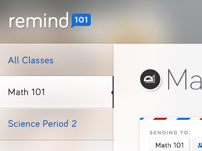


Ended up locking the nav to the left because there is so much content on the page. Having that space on the side ended up crowding everything else. I also decided to change the blue color to a more opaque white since the blue ended up being the actionable color, as oppose to the selected color.
Attaching the full view of this direction now that its semi-complete.