I think the type should have more weight than the lines surrounding, but maybe only slightly. Other than that, totally RAD! Beautiful lines and texture!
@Nicholas D'Amico i suppose the animals relate to the part of the story where the prodigal son has spent all his money and finds himself working for a boss, feeding pigs, and realising those pigs get better food than he can get himself... not sure though.
@Doug Penick ah yea, got it, suppose i saw little importance in the calf, so it didn't connect with me right away, i just figured he might have herded calfs too.
Forgot to mention, i really like it, but if you're pointing out the strenght of the word stronger i think it would do well to make it a bit bolder.
17 Responses
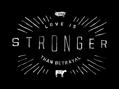
T-Shirt design for a rad little company @Jay Roberts set me up with... Thoughts?
It's built around the story of the Prodigal Son.
6 months ago
I think the type should have more weight than the lines surrounding, but maybe only slightly. Other than that, totally RAD! Beautiful lines and texture!
6 months ago
Is the font hand drawn?
6 months ago
@Marc Burmich Kinda sorta... I drew it by hand, but it's pretty much exactly United Sans.
6 months ago
@Doug Penick I agree with @Laura Bohill maybe thicken the stronger up to create a little depth. Whats the significants with the animals?
6 months ago
I think it's perfect. Don't change anything.
6 months ago
@Nicholas D'Amico i suppose the animals relate to the part of the story where the prodigal son has spent all his money and finds himself working for a boss, feeding pigs, and realising those pigs get better food than he can get himself... not sure though.
6 months ago
@Richard de Ruijter @Nicholas D'Amico yessir, and the young calf at the bottom for the meal that the father prepares at the son's return home.
6 months ago
@Scott Hill thanks dude! That's pretty swell feedback
6 months ago
@Doug Penick ah yea, got it, suppose i saw little importance in the calf, so it didn't connect with me right away, i just figured he might have herded calfs too.
Forgot to mention, i really like it, but if you're pointing out the strenght of the word stronger i think it would do well to make it a bit bolder.
6 months ago
Man, this is pretty fantastic!
6 months ago
Love this, Doug!
6 months ago
Can't get over this. Love it.
6 months ago
Nice man, nice.
6 months ago
I love it. But I agree with the "bolder" people
6 months ago
this is really nice. (y)
6 months ago
Very nice.
6 months ago