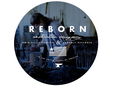
I'm loving what is going on here, can't wait to see more. The only thing i'm struggling with is the &. Kinda seems a bit out of place. Perhaps a different typeface choice?But I do love the Futura with the script, nice work. Also really diggin the American flag. Nice touch.
Hey bud. It's a great start. Just a couple nit-picky things.
That script is really hard for me to read. It took a couple passes to read it right. Your flag has fifteen stripes ;) Maybe make it with seven, thicker stripes...a more stylized flag instead of an actual representation.
I love how historical this entire piece feels. I'm really a fan. As everyone already pointed out though, the script should be changed even though I love that one. Obviously the viewer is more important though haha. The elements seem to be misaligned as well. Unless you didn't want to center them? And any reason you curved "in the united states of america" ? Maybe try making that straight?
It's headed in the right direction for sure. I would suggest that it feels a bit on the busy side, plus everything looks very stacked on one another. I like Joshua's idea of less stripes on a more stylized flag (since you've already stylized it, plus it would cut down on visual clutter).
I would also drop the "originally crafted and proudly restored" down with "in the United States of America" underneath the flag. And then maybe put the flag and the anvil on the same line with a thin vertical division line between the two.
17 Responses
Pro
Caleb Royce Lummer
Working on some preliminary ideas for an emerging brand. Suggestions are massively appreciated (as always). Cheers!
5 months ago
I'm loving what is going on here, can't wait to see more. The only thing i'm struggling with is the &. Kinda seems a bit out of place. Perhaps a different typeface choice?But I do love the Futura with the script, nice work. Also really diggin the American flag. Nice touch.
5 months ago
agree with Peterson Timothy
5 months ago
Pro
Joshua Krohn
Hey bud. It's a great start. Just a couple nit-picky things.
That script is really hard for me to read. It took a couple passes to read it right. Your flag has fifteen stripes ;) Maybe make it with seven, thicker stripes...a more stylized flag instead of an actual representation.
5 months ago
I agree with Joshua. The script is a super tough read for me.
5 months ago
Pro
Cat Smith
I love how historical this entire piece feels. I'm really a fan. As everyone already pointed out though, the script should be changed even though I love that one. Obviously the viewer is more important though haha. The elements seem to be misaligned as well. Unless you didn't want to center them? And any reason you curved "in the united states of america" ? Maybe try making that straight?
5 months ago
Pro
Joseph Marsh
It's headed in the right direction for sure. I would suggest that it feels a bit on the busy side, plus everything looks very stacked on one another. I like Joshua's idea of less stripes on a more stylized flag (since you've already stylized it, plus it would cut down on visual clutter).
I would also drop the "originally crafted and proudly restored" down with "in the United States of America" underneath the flag. And then maybe put the flag and the anvil on the same line with a thin vertical division line between the two.
Just my two pennies :)
5 months ago
Pro
Greg Christian
we talking Texas here? That single star made me think so.
5 months ago
Pro
Caleb Royce Lummer
@Greg Christian haha, we gotta hang soon, dude.
5 months ago
Pro
Greg Christian
@Caleb Royce Lummer duder next week lets kick it.
5 months ago
Pro
Maigen Sawyer
I love this! Awesome job Caleb.
5 months ago
Pro
Caleb Royce Lummer
@Maigen Sawyer Thx Maigen!!
5 months ago
Pro
Guilherme Costa
This looks stunning! Love the filter and the elements on the top of the picture. It works perfectly!
5 months ago
Pro
Caleb Royce Lummer
@Peterson Timothy @Joshua Krohn @Joseph Marsh @Cat Smith you guys are awesome. thx for the great feedback. will be working on a revision to get your thoughts on. cheers!
5 months ago
Amazing typography there, good photography too! Inspired! :D
5 months ago
Man this is just awesome. Great!
5 months ago
Pro
Charles Patterson
@Caleb Royce Lummer I love your work man! Everything looks great :)
about 1 month ago