Find designers
Designer search
Quickly find your next designer
Post a job
The #1 job board for design talent
Inspiration
Courses
UX Diploma
Learn UX design from scratch in 6 months
UI Certificate
12-week UI skill building for designers
Live interactive workshops
with design professionals
Jobs
Go Pro
Log in
Dribbble: the community for graphic design
Log in
Sign up
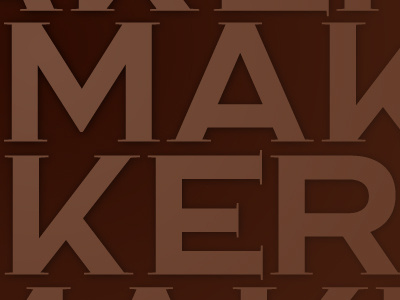
Maker v3
Christopher DeCaro
Available for work
Follow
Following
Like
Get in touch
#361308
#6E4533
#532C1C
Download color palette
I think this is the near final version of the lettering...
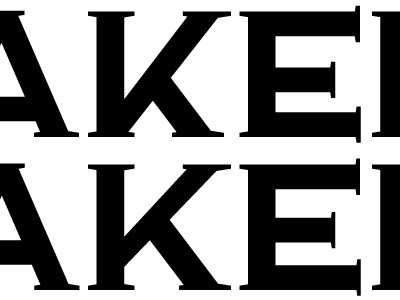
Rebound of
Maker v2
By
Christopher DeCaro
lettering
type
typography
View all tags
Posted on Dec 25, 2012
323
0
7
3
View feedback
Christopher DeCaro
Welcome to my design portfolio on Dribbble
Get in touch
More by Christopher DeCaro
View profile
Previous
Next
Loading…
Loading…
Loading…