Seagull Holdings Logo


Yoohooo happyworkinchristmas gentz! :))))))
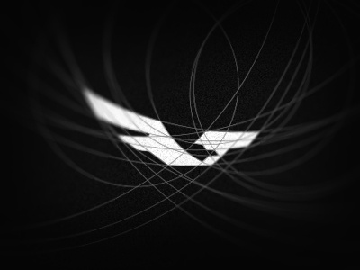
Just a refinement on that logo. I've tried to remove the V too much evident and give some more movement with these courves. I tried to keep the seagull. Feedback is very appreciated.
Best wishes to everyone and an amazing 2013!


