Find designers
Designer search
Quickly find your next designer
Post a job
The #1 job board for design talent
Inspiration
Courses
UX Diploma
Learn UX design from scratch in 6 months
UI Certificate
12-week UI skill building for designers
Live interactive workshops
with design professionals
Jobs
Go Pro
Log in
Dribbble: the community for graphic design
Log in
Sign up
Portfolio 2
Ashish Thakkar
Available for work
Follow
Following
Like
Get in touch
#FCF65A
#2B2827
#A8A445
#FCFCF8
#524E3E
#615E32
Download color palette
Experimenting...
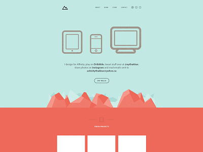
Rebound of
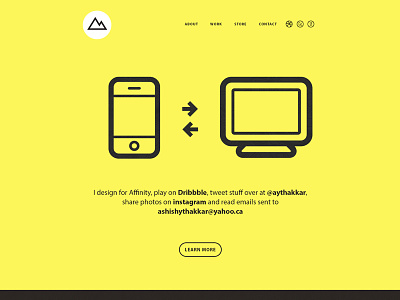
Minimalist Portfolio
By
Ashish Thakkar
minimal
portfolio
responsive
View all tags
Posted on Dec 22, 2012
2,618
12
66
6
View feedback
Ashish Thakkar
Get in touch
More by Ashish Thakkar
View profile
Previous
Next
Loading…
Loading…
Loading…