Find designers
Designer search
Quickly find your next designer
Post a job
The #1 job board for design talent
Inspiration
Courses
UX Diploma
Learn UX design from scratch in 6 months
UI Certificate
12-week UI skill building for designers
Live interactive workshops
with design professionals
Jobs
Go Pro
Log in
Dribbble: the community for graphic design
Log in
Sign up
New Message
Nathan Walker
Available for work
Follow
Following
Like
Get in touch
#13100D
#49535E
#3A4855
#DFCFAF
#C4A062
#5A718E
#7299A5
Download color palette
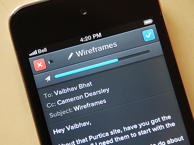
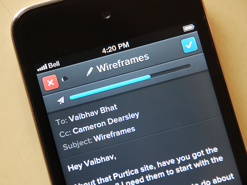
Sending message screen. Once again inspired by @Victor Erixon.
Full res
and
@2x.
Rebound of
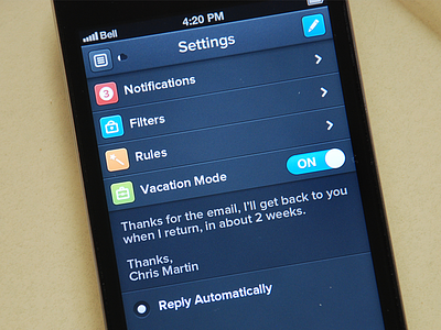
Edit Settings
By
Nathan Walker
4
4s
5
app
email
erixon
icons
iphone
lack of originality
settings
ui
View all tags
Posted on Dec 22, 2012
8,280
24
207
23
View feedback
Nathan Walker
Designer & frontend developer
Get in touch
More by Nathan Walker
View profile
Previous
Next
Loading…
Loading…
Loading…


