Js-dropdown

31 Responses (page 1 of 2)

  1. Pro Shaun Moynihan Shaun Moynihan

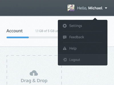
    Did some work on a new file sharing site recently, thought I'd share with the dribbble crowd. Feedback always appreciated.

    5 months ago

  2. Corey Haggard Corey Haggard

    I like this @Shaun (Sevenly) really nice work.

    likes

    5 months ago

  3. Pro Galen Gidman Galen Gidman

    Getting better

    likes

    5 months ago

  4. Josh King Josh King

    It seems a little dark to me man. A little hard to read?

    likes

    5 months ago

  5. Pro Shaun Moynihan Shaun Moynihan

    @Josh King The font I'm used doesn't render very well in Photoshop. The font/color have appropriate contrast on the web—thanks for the feedback!

    likes

    5 months ago

  6. Jona Jona

    Nice stuff! To me its position feels too far left though, so I'd suggest lining it up with the element above and moving the little callout triangle to the center as well.

    likes

    5 months ago

  7. Pro Kim Wouters Kim Wouters

    Really like this one Shaun, amazing work. I'm especially a fan of the color combination. Personally, I would move the log out icon one or two pixels to the left. In my opinion that would make it seems visually aligned better, since I feel like right now, the arrow is pushing the icon to the right. Just nitpicking though, can't wait to see the rest!

    likes

    5 months ago

  8. Pro Spencer Hamm Spencer Hamm

    the way logout is shaded is awesome. great work!

    likes

    5 months ago

  9. Pro Shaun Moynihan Shaun Moynihan

    @Jona The crop you are seeing in this shot is representational of the actual position in the layout.

    5 months ago

  10. Pro Sam Asante Sam Asante

    I can't fault this, Shaun. Great work all around.

    likes

    5 months ago

  11. Pro Shaun Moynihan Shaun Moynihan

    @Kim Wouters I agree. That icon has been a pain since it doesn't have the same overall dimensions as the others. Thinking I'll change it up with another icon better suited for the position.

    Thanks for the feedback!

    5 months ago

  12. Jona Jona

    @Shaun Assuming you've missed a "not" there, I see. Could've figured as much myself.

    likes

    5 months ago

  13. Pro Shaun Moynihan Shaun Moynihan

    @Jona Didn't miss it, meant it. It's aligned left on the nav bar hugging the right side of the browser just like it's shown in the shot. I suppose I could have shown it off better. =]

    5 months ago

  14. Pro Jess Brown Jess Brown

    Nice man! Can't wait to see what you and the team have coming up.

    Hi @Michael Deol ⚓ #luvvit

    likes

    5 months ago

  15. Pro Shaun Moynihan Shaun Moynihan

    @Jess Brown Heh, thanks man. This is just some work I completed previously. I'll be posting @Sevenly stuff sooner than later!

    5 months ago

  16. Jona Jona

    @Shaun Moynihan Oh okay, so my suggestion is applicable afterall. As I said, I believe the dropdown is too far left. I see, of course, that it is properly aligned with the nav's little downward arrow, but due to the fact that the arrow doesn't visually weigh as much as the other nav elements and the dropdown has an inner padding, it feels like it's too far on the left. But anyway, guess this is just a difference in opinion.

    likes

    5 months ago

  17. Pro Jess Brown Jess Brown

    @Shaun Moynihan my bad I just saw Michael and figured it was Sevenly. Still great.

    likes

    5 months ago

  18. Pro Gil Gil

    sweet dude!

    likes

    5 months ago

  19. Andrey Dyadyura Andrey Dyadyura

    nice one!

    likes

    5 months ago

  20. Pro Craig Murray Craig Murray

    Nice looking work!

    likes

    5 months ago

  21. Pro Luboš Volkov Luboš Volkov

    that soft shadow under the main bar is pretty nice! :)

    likes

    5 months ago

  22. Pro Haziq Mir Haziq Mir

    Awesome. You probably need a better glyph for Help. Or maybe it is just me.

    likes

    5 months ago

  23. Pro Tanveer Junayed  Tanveer Junayed 

    Looks great. Agee on the help glyph. BTW, what font it is? Din pro?

    likes

    5 months ago

  24. Pro Shaun Moynihan Shaun Moynihan

    @Haziq Mir @Tanveer Junayed  Thanks for the feedback. We decided to stick with the current icon...although it is an 'I' rather than an exclamation point (as shown in the shot).

    5 months ago

  25. Pro Jimmy Jimmy

    Yeah I'd use a circle instead of a triangle. Triangle is a warning road sign in most countries.

    likes

    5 months ago

keyboard shortcuts: previous shot next shot L or F like