KOMORU brand

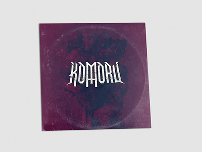

I was asked earlier today to create a logo and potential EP cover for the forming metal band "Komoru" who are so ridiculously heavy, the only way I could even take this logo is with a sharp bold type. Upside down cross was added inside the M to give a nice mark to it, maybe leans a little to heavily into the metal stereotype, but was the client's request that one would be added somewhere.
EP background design was a photomanipulation using inverted imagery, gradient maps, textures and layer states.
It's a project that I enjoyed, I like and I'm overall pretty happy with for a remarkably productive Saturday afternoon. I hope you guys like it too!


