Find designers
Designer search
Quickly find your next designer
Post a job
The #1 job board for design talent
Inspiration
Courses
UX Diploma
Learn UX design from scratch in 6 months
UI Certificate
12-week UI skill building for designers
Live interactive workshops
with design professionals
Jobs
Go Pro
Log in
Dribbble: the community for graphic design
Log in
Sign up
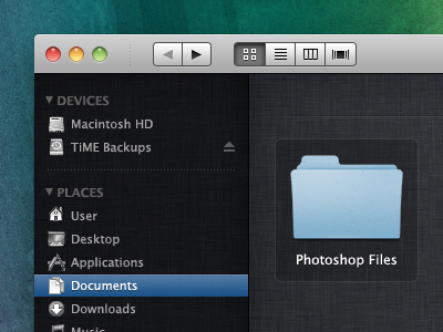
Finder on Mac OS X Lion
Matthew Skiles
Available for work
Follow
Following
Like
Get in touch
#1E1F23
#1E5C5B
#4C5657
#ACC9DD
#C2C2C2
#366695
#7A8E77
Download color palette
View
Fullsize
black
duper
finder
linen
lion
pooper
scooper
super
View all tags
Posted on Dec 5, 2010
11,677
5
136
29
View feedback
Matthew Skiles
Get in touch
More by Matthew Skiles
View profile
Previous
Next
Loading…
Loading…
Loading…


