Find designers
Designer search
Quickly find your next designer
Post a job
The #1 job board for design talent
Inspiration
Courses
UX Diploma
Learn UX design from scratch in 6 months
UI Certificate
12-week UI skill building for designers
Live interactive workshops
with design professionals
Jobs
Go Pro
Log in
Dribbble: the community for graphic design
Log in
Sign up
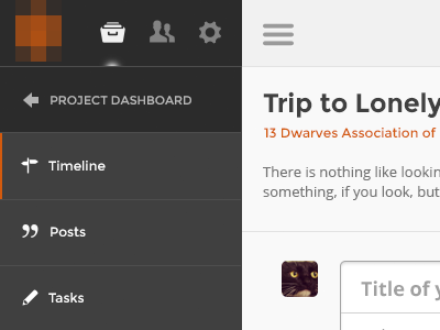
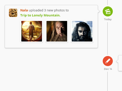
Timeline II
Razlan Hanafiah
Available for work
Follow
Following
Like
Get in touch
#F7F7F7
#424242
#2C2B2B
#9E9E9E
#A44F1A
#E5B6A2
#CE9168
Download color palette
Rebound of
Timeline
By
Razlan Hanafiah
dashboard
project management
timeline
ui
ux
web app
View all tags
Posted on Dec 17, 2012
767
1
9
2
View feedback
Razlan Hanafiah
Get in touch
More by Razlan Hanafiah
View profile
Previous
Next
Loading…
Loading…
Loading…