Find designers
Designer search
Quickly find your next designer
Post a job
The #1 job board for design talent
Inspiration
Courses
UX Diploma
Learn UX design from scratch in 6 months
UI Certificate
12-week UI skill building for designers
Live interactive workshops
with design professionals
Jobs
Go Pro
Log in
Dribbble: the community for graphic design
Log in
Sign up
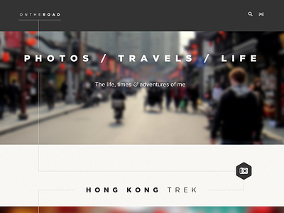
photos / travels
Seán Halpin
Available for work
Follow
Following
Like
Get in touch
#252323
#F7F6F2
#626061
#7A8A85
#CBBFAD
#995045
Download color palette
adventure
homepage
on the road
photo
photos
travels
tumblog
ui
ux
View all tags
Posted on Dec 15, 2012
5,194
22
118
6
View feedback
Seán Halpin
Hi. I'm Seán. A Designer.
Get in touch
More by Seán Halpin
View profile
Previous
Next
Loading…
Loading…
Loading…