


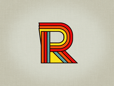
Rockatee Logo 2013 (WIP)

Insomnia! Gaaaah!
Initially, I had wanted to have a logo with just the first letter. I've had a few attempts that are still archived on my dribbble page from way back. Then I changed course and created custom lettering for my brand. However, so far, I find those iterations a little too boring, too rational and not really represent me or my work.
My aesthetic criteria are:
Make it bold
Make it simple
Make it vintage/retro
Make it friendly
In addition to representing the style I most identify with (which is Bauhaus, Neue Sachlichkeit, and Pop Art) I want it to express warmness, kindness and clarity, amongst other things. Most important of all, obviously, is that it should be memorable, but as this is a first attempt, I'll have many, many more iterations to do.
Not too happy with the colors yet. I need to find a better balance because I like bold but I also like muted, saturated colors and the latter is somewhat amiss in this iteration.
Well, it's a Work-in-progress, so comments and critique are most welcomed, as always.


