nice man,i see lately u been ading those "scratches" those sharp details i like that a lot,gives it feel of material without using texture ,and also gives more agressive look which is always awesome
@Nemo Jovanovic aka Fracturize Thanks. Yeah, got on this concrete kick after a piece I did for Osiris and just trying to explore it more now. Feel like I'm getting the hand of it now!
8 Responses
Pro
Jared Mirabile
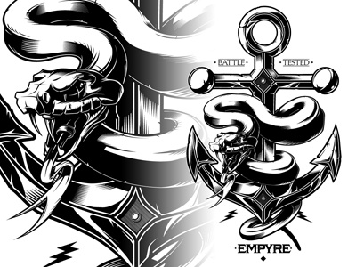
Merch development for Zumiez private label line "Empyre"
6 months ago
Such a lovely and bad ass drawing. I think typography should might get the same treatment and attention maybe?
6 months ago
Pro
Jared Mirabile
@Diego Ribeiro Considered it but in the end the complexity of the design made me lean towards a more simplistic approach on the type front!
6 months ago
Pro
Nemanja Jovanovic aka Frac...
nice man,i see lately u been ading those "scratches" those sharp details i like that a lot,gives it feel of material without using texture ,and also gives more agressive look which is always awesome
6 months ago
Pro
Jared Mirabile
@Nemo Jovanovic aka Fracturize Thanks. Yeah, got on this concrete kick after a piece I did for Osiris and just trying to explore it more now. Feel like I'm getting the hand of it now!
6 months ago
Pro
Nemanja Jovanovic aka Frac...
oh yeah that was the piece ,yeah man def nailing it ,it flows nicely following forms super nice look!
6 months ago
Agree with your rationale behind more simplified type. The illo does such a great job it doesn't need heavy type to validate it. Amazing work!
6 months ago
Pro
Jared Mirabile
@Nicholas Hammond Thanks!
6 months ago