Sakana Identity Redesign

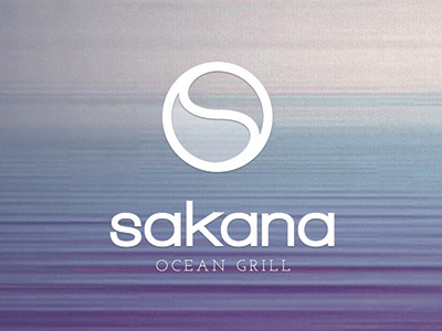
Grrrr. The colors are rendering funny. the background was way more muted in the original...
Anyway, this is another version of the Sakana identity. With this one, I used the "s" and "o" to suggest the Asian heritage of the restaurant by creating a yin/yang that also suggets an ocean wave. yeah. lol.