Find designers
Designer search
Quickly find your next designer
Post a job
The #1 job board for design talent
Inspiration
Courses
UX Diploma
Learn UX design from scratch in 6 months
UI Certificate
12-week UI skill building for designers
Live interactive workshops
with design professionals
Jobs
Go Pro
Log in
Dribbble: the community for graphic design
Advance your career with a Professional Diploma in UX Design
Learn more
Log in
Sign up
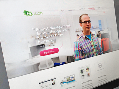
Invision
Bill Kenney
Available for work
Follow
Following
Like
Get in touch
#E0DFDF
#C6C3BC
#676667
#83808A
#B25758
#282329
Download color palette
Working out a simplified lighter version of the last shot I posted.
Created with the Focus Lab team
awesomeness
design
focus lab
invision
web design
View all tags
Posted on Dec 5, 2012
18,855
89
505
37
View feedback
Bill Kenney
Shaping the worlds leading B2B Brands @ Focus Lab & Odi →
Get in touch
More by Bill Kenney
View profile
Previous
Next
Loading…
Loading…
Loading…