Find designers
Designer search
Quickly find your next designer
Post a job
The #1 job board for design talent
Inspiration
Courses
UX Diploma
Learn UX design from scratch in 6 months
UI Certificate
12-week UI skill building for designers
Live interactive workshops
with design professionals
Jobs
Go Pro
Log in
Dribbble: the community for graphic design
Advance your career with a Professional Diploma in UX Design
Learn more
Log in
Sign up
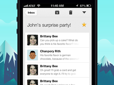
Gmail 2.0 Conversation View
Chanpory Rith
Follow
Following
Like
#F5F5F6
#95F1F1
#0A0A0C
#1C708B
#ACA79F
#415570
#699D91
Download color palette
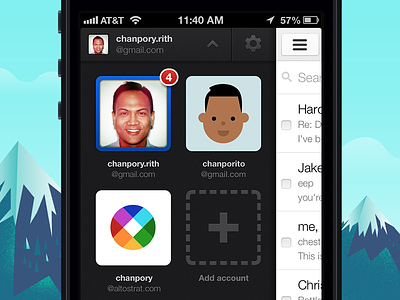
Rebound of
Gmail 2.0 Multi-login
By
Chanpory Rith
gmail
ios
iphone
minimal
mobile
retina
View all tags
Posted on Dec 5, 2012
2,783
8
77
19
View feedback
Chanpory Rith
More by Chanpory Rith
View profile
Previous
Next
Loading…