Google+

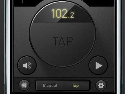
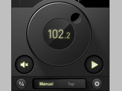
Steinway Metronome App

16 Responses

  1. Pro Google+ Jesse Bennett-Chamberlain

    Working on the depressed versions of the buttons. Not quite sure on the glow of those.

    For the timing button at the bottom left, I'm going to see if it's possible to make it dynamic, and have it change with which ever signature is selected.

    about 2 years ago

  2. Pro Dribbble Jesse Gardner

    Looks great, Jesse. The glow gives them a sickly look, though. Perhaps try using the depression alone to convey activation?

    likes

    about 2 years ago

  3. Dustin_askins_avatar-20110413-dka-002 Dustin Askins

    Good grief that "Manual/Tap" toggle rocks. Perfect.

    about 2 years ago

  4. Pro 500px Chad Engle

    Love the toggle & that it actually looks like it's recessed because the left side is pushed in. Rockin'

    about 2 years ago

  5. Esquareda-square-black-white Eric E. Anderson

    I like the text color change on the active state of the toggle, maybe just kill the glow? It seems to 'lift' the text off the surface a little...

    about 2 years ago

  6. Photo jan 24, 9 19 51 am Sean Sperte

    Maybe add a slight inner shadow (like you have on the gear icon) to the icons to help augment the glow and make them seem more integrated with the button.

    about 2 years ago

  7. Eddit_2 Eddie Wilson

    In remembering toggles like this in the real world, the two sides were not flush to each other, there we're bent like an almost flattened V. The selected side was flush to the face mount, while the unselected side protruded at an angle like you have on the right.

    But that is merely food for though. This rocks.

    about 2 years ago

  8. Pro Avatar Bruce Spang

    The circle depression on the metronome spinner seems very awkward. What if you made it slightly lighter, and maybe faded it out with a gradient.

    about 2 years ago

  9. Avatar2010 William Wilkinson

    Manual / Tap

    :o

    about 2 years ago

  10. Pro Pic Benjamin De Cock

    You made my day, Jesse.

    about 2 years ago

  11. Pro 1f8f6ded95a14175acba6c272c967787_7 Philip Renich

    I like the idea of a backlit button when activated. I think you can pull it off, it just needs some refinement. Maybe adjust the hue (slightly yellower/greener? hmm, not sure) and pull the glow back a hair.

    It may be artifacts of this uploaded image, but the edges around the depressed buttons seems a little sharp.

    pretty darn hot all around though Jesse!

    about 2 years ago

  12. Pro Liam Liam McKay

    Beautiful, shaping up really nicely.

    about 2 years ago

  13. Pro Google+ Jesse Bennett-Chamberlain

    Good eyes everyone... thanks for helping me out. Making some more tweaks to it.

    Steinway is still in the process of finding a developer for this app as well, so if any are interested, or know of someone, please let me know.

    about 2 years ago

  14. Darren01 Darren Beckett

    My company would be interested in working on this one. I sent an email via your contact form on your site, but our URL is http://threemagination.com

    about 2 years ago

  15. Raja-display-new Raja Sandhu

    Hey Jesse! - lovely work

    over 1 year ago

  16. Pro E Trent McBride

    Just amazing, gorgeous and beautiful.

    5 months ago

keyboard shortcuts: previous shot next shot L or F like