WVE Brand Board


View the complete project at valeriediazdearce.com/wve-branding
ABOUT
In 2015, I began cooking a lot more at home as a way to destress after a long day of work. Every week, I would check out new cook books from the library and try an array of new recipes. I would occasionally share photos of my dinner on Instagram and my friends and family loved seeing what I was cooking. So when a friend suggested that I start a food Instagram account, I took the leap and created What's Valpal Eating. My mission is to inspire others to cook at home themselves and to promote healthy, sustainable, and low-cost recipes.
BRANDING
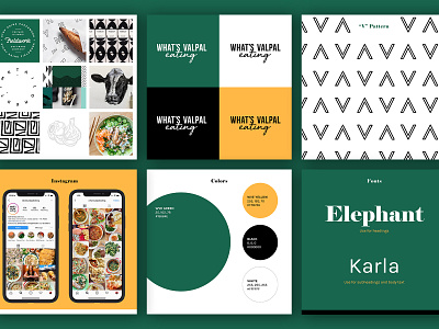
The color palette for my food brand is inspired by, well, food! The sun hits my kitchen table in the most beautiful way right before sunset. The setting sun streams in the window and my cutting board and olive oil shine with golden hues. I believe that cooking mostly plants is the key to overall health and so my cutting board is covered with kale, broccoli and other dark green produce. These images inspired the dark, rich green and warm yellow colors of the What's Valpal Eating brand.
My cooking is a mix of both complicated and easy. Some nights I like to tackle difficult techniques or ingredients. Other nights I just need to throw a bunch things into a slow cooker because life gets busy. This mix of more sophisticated cooking with easy, cheap cooking inspired the logo design. The font used for "What's Valpal" is modern, clean and serious. The font for "eating" is playful and messy.
The header font, Elephant, is eye-catching and on-trend. It conveys a more sophisticated lifestyle, while remaining playful with its curly serifs. Karla font, used for subheading and body text, is slightly more rigid, but pairs well with the chunky Elephant font.
Continuing the theme of playful paired with sophisticated, I created a custom, hand-drawn pattern. The pattern is a series of V's (for Valpal) alternating orientation. The lines have a chalk texture, which gives it the same look and feel as the logo. The pattern is simple, clean and personal.
APPLICATION
This brand board will guide the creation of the What's Valpal Eating website and blog. I am currently designing and coding the website, and am using these brand guidelines to make visual and UX design decisions. I look forward to launching the finished site which will include original recipes, reviews of cookbooks and blogs, and resources for people who are new to home cooking.


