Given any thought to making it in HTML? Obviously I don't know how often you intend on handing out a physical resume versus sending it out as a link or attachment, but I rather like how @Yassine Bentaieb handled his resume on his new site (http://www.yassinebentaieb.com/#resume). Something like that could help you avoid having to show those nasty URL text links, and would probably make potential employees far more likely to actually go to those URLs. Just a thought.
Excellent point @Dennis :) Perhaps making a resume in HTML is a great way to go, accessible almost anywhere, and if the print styles are right, can be printed nicely.
I'm not sure I like it and I'm going to that thing that's unhelpful and say that I can't quite put my finger on why although here's a couple of brain dump suggestions.
The weighting of the two columns feels wrong, both visually and in terms of how you're using them to split your personal and professional background. It just feels a bit cramped to me.
I'm a big fan of your projects, they're well designed and thought out and rightly very popular but I don't think this design really does much to showcase that and in light of you being at the beginning of your career, I think it would be worth using these as the highlights and making more of their success, the number of downloads/retweets/users etc over your current/recent role.
Finally, that personal statement is pretty cheesy. Again, I know you're an exceptionally passionate designer and the effort you put into your work is beyond question but as someone who does get CV's regularly I'd have to say the personal statement is a tough one to strike a balance with in terms of being genuine (which you are) and not being too "designer-y" to the point of sounding like a hipster startup.
Last note, I'm sure it's more for the purpose of not having your number online but don't forget to include a contact number on your CV.
Sorry if the above sounds really harsh, hope it's not taken as such and that it helps a little in refining.
I have to say Dan, I hate CVs...in their standardised natural form, they don't fit into this industry one bit. They stifle the very things that are going to make an employer hire you.
This CV doesn't sell you...not one bit. It doesn't scream of the good work you've done. For example, that Animate.css just stuck on the side, it'll get a steady nod of "interesting", without them realising that it was you that build this awesome library of animations that probably thousands of people have played with by now.
In my honest opinion, I'd expect your CV to be pretty much like your website; sounding like you and in your style. If you scrubbed your name off this thing, it wouldn't get you hired by half the people who would already hire you in a heartbeat.
9 Responses
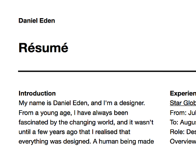
As part of the great career search, I made a new CV/Résumé. It gave me a great excuse to practice my print design chops.
Many thanks to the talented Alix Land for help with my grid and to Hannah Brook for her help with my words.
Full view/download here.
6 months ago
Pro
Zander Brade
Looks nice:) Simple, how it should be. Was this done in Sketch? I've never understood the creation of PDF's haha. Good work Dan.
6 months ago
Given any thought to making it in HTML? Obviously I don't know how often you intend on handing out a physical resume versus sending it out as a link or attachment, but I rather like how @Yassine Bentaieb handled his resume on his new site (http://www.yassinebentaieb.com/#resume). Something like that could help you avoid having to show those nasty URL text links, and would probably make potential employees far more likely to actually go to those URLs. Just a thought.
6 months ago
Excellent point @Dennis :) Perhaps making a resume in HTML is a great way to go, accessible almost anywhere, and if the print styles are right, can be printed nicely.
6 months ago
A bit too simple in my opinion. @Zander Brade I think it's made in InDesign.
6 months ago
Pro
James Young
I'm not sure I like it and I'm going to that thing that's unhelpful and say that I can't quite put my finger on why although here's a couple of brain dump suggestions.
The weighting of the two columns feels wrong, both visually and in terms of how you're using them to split your personal and professional background. It just feels a bit cramped to me.
I'm a big fan of your projects, they're well designed and thought out and rightly very popular but I don't think this design really does much to showcase that and in light of you being at the beginning of your career, I think it would be worth using these as the highlights and making more of their success, the number of downloads/retweets/users etc over your current/recent role.
Finally, that personal statement is pretty cheesy. Again, I know you're an exceptionally passionate designer and the effort you put into your work is beyond question but as someone who does get CV's regularly I'd have to say the personal statement is a tough one to strike a balance with in terms of being genuine (which you are) and not being too "designer-y" to the point of sounding like a hipster startup.
Last note, I'm sure it's more for the purpose of not having your number online but don't forget to include a contact number on your CV.
Sorry if the above sounds really harsh, hope it's not taken as such and that it helps a little in refining.
J.
6 months ago
I have to say Dan, I hate CVs...in their standardised natural form, they don't fit into this industry one bit. They stifle the very things that are going to make an employer hire you.
This CV doesn't sell you...not one bit. It doesn't scream of the good work you've done. For example, that Animate.css just stuck on the side, it'll get a steady nod of "interesting", without them realising that it was you that build this awesome library of animations that probably thousands of people have played with by now.
In my honest opinion, I'd expect your CV to be pretty much like your website; sounding like you and in your style. If you scrubbed your name off this thing, it wouldn't get you hired by half the people who would already hire you in a heartbeat.
6 months ago
Great minimalism and grid work.
6 months ago
Pro
Henry Modisett
www.cvparade.com
5 months ago