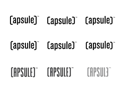
Capsule Logo Variations

After the incredibly useful comments on previous Dribbble, have made some significant changes.
First two rows based on same font, but with the brackets curved to more resemble a C. The first row has a slightly wider bracket than the second row. Each column has varying heights and position of the bracket.
Third row is completely different. Bastardised condensed font, with some nice curves.
Two variations in 1st column. Top one has the brackets slightly taller, falling half a line width over the base line and cap height. The bottom one has the brackets all the same cap height.
There was a third option, third column. Not sure if this is what Rogie was hinting at, which is reversing the E, making it the end bracket. But can't quite get my head round it at the moment. :)
The important thing is that this is not an exercise in trying to replicate a perfect capsule shape, it's for a serious identity and not for fun. So my concern with the third row is that it falls too much in this category. Whereas the lower case options feel more raw and typographic, but hinting at the capsule shape.
I'm still blind to this as have been staring at the project for some time now. Interested to see which ones you feel work best.


