The Simple Set

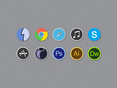
decided to ditch my last set of icons (for now) and focus on a new style.
Edit:
Cheers for all the feedback guys,
ive fixed up the type on skype and the adobe suite.
See what i've changed
decided to ditch my last set of icons (for now) and focus on a new style.
Edit:
Cheers for all the feedback guys,
ive fixed up the type on skype and the adobe suite.
See what i've changed


