


Mobile iTunes 11

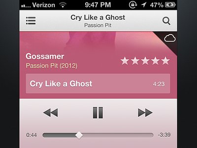

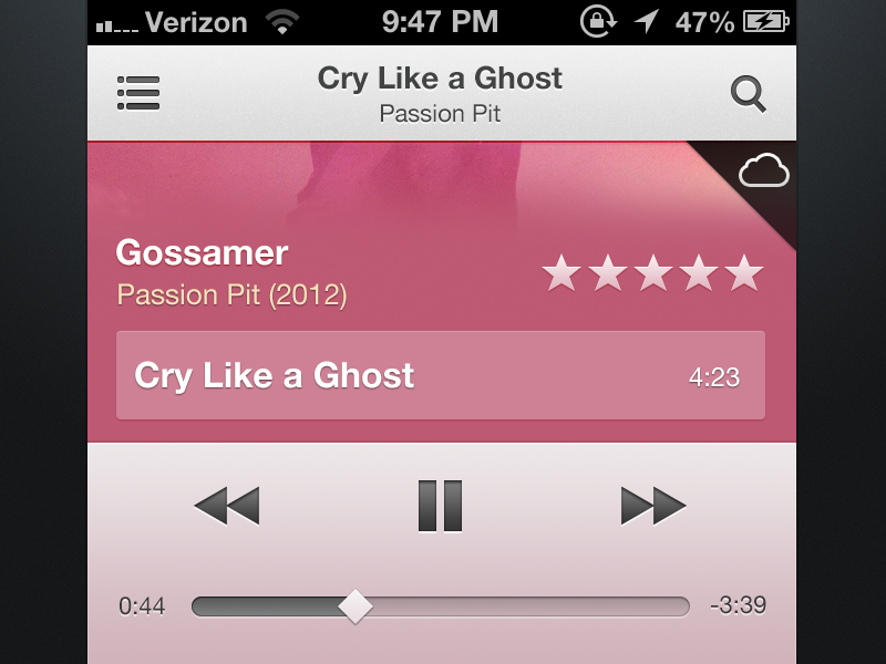
I had some free time today, so I decided to throw together what I think the Music.app on iOS would look like if it matched the new iTunes 11 interface.
The album art would work similar to Rdio's new iOS app, where the entire view scrolls, revealing all the songs on the album.
Check out the @2x image for a clearer shot and the attachment for the full view.


