Find designers
Designer search
Quickly find your next designer
Post a job
The #1 job board for design talent
Inspiration
Courses
UX Diploma
Learn UX design from scratch in 6 months
UI Certificate
12-week UI skill building for designers
Live interactive workshops
with design professionals
Jobs
Go Pro
Log in
Dribbble: the community for graphic design
Log in
Sign up
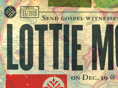
Lottie Moon Splash
Ryan Harrison
Available for work
Follow
Following
Like
Get in touch
#E6D9A9
#364439
#AEB195
#D2BFA1
#BE4436
#4F583F
#A7A069
Download color palette
church
letterpress
overprint
splash
type
typography
View all tags
Posted on Nov 28, 2010
2,291
2
73
11
View feedback
Ryan Harrison
Stories & Symbols for New Narratives
Get in touch
More by Ryan Harrison
View profile
Previous
Next
Loading…
Loading…
Loading…