@Bruce Sullivan - there's a better way to achieve the effect you have on the right side. Lose the amount of drop shadow on each box and simply add a 1px dark line like you've done on the rest of the site, will clean it up a bit more. Other than that good. Not sure about the font render of "Direction". Welcome!
9 Responses
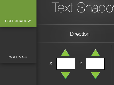
Im working on a CSS3 generator, for kicks and giggles!
Full size available here: http://cl.ly/image/2a1U3P3L0Z47
7 months ago
@Bruce Sullivan - there's a better way to achieve the effect you have on the right side. Lose the amount of drop shadow on each box and simply add a 1px dark line like you've done on the rest of the site, will clean it up a bit more. Other than that good. Not sure about the font render of "Direction". Welcome!
7 months ago
Nice shot! welcome aboard :)
7 months ago
Hey, not bad for the first time :)
7 months ago
good font, and good color.
Welcome!
7 months ago
Good work :) Wellcome!
7 months ago
Great :)
7 months ago
@Ty Thank ya sir, I'll keep that in mind! As for the font rendering, I think that's just illustrator messing with me.
7 months ago
I like.
7 months ago