Find designers
Designer search
Quickly find your next designer
Post a job
The #1 job board for design talent
Inspiration
Courses
UX Diploma
Learn UX design from scratch in 6 months
UI Certificate
12-week UI skill building for designers
Live interactive workshops
with design professionals
Jobs
Go Pro
Log in
Dribbble: the community for graphic design
Advance your career with a Professional Diploma in UX Design
Learn more
Log in
Sign up
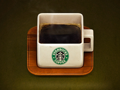
Coffee Icon
Alexandr Nohrin
Available for work
Follow
Following
Like
Get in touch
#2B2108
#564711
#D9CDB3
#994F1A
#B2926B
#533007
#32633D
#5C9066
Download color palette
Little rounded coffee icon. Made just for fun:)
coffee
cup
icon
View all tags
Posted on Nov 28, 2012
8,234
35
326
17
View feedback
Alexandr Nohrin
Welcome to my design portfolio on Dribbble
Get in touch
More by Alexandr Nohrin
View profile
Previous
Next
Loading…
Loading…
Loading…