


Timeline

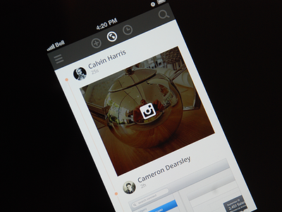


This is a simple, minimalistic timeline UI I designed to practice with flat UI a bit more. Most of the icons are from a very nice set by @Victor Erixon. The full-sizes for the iPhone 4S and 5 are attached.
This is a simple, minimalistic timeline UI I designed to practice with flat UI a bit more. Most of the icons are from a very nice set by @Victor Erixon. The full-sizes for the iPhone 4S and 5 are attached.


