Find designers
Designer search
Quickly find your next designer
Post a job
The #1 job board for design talent
Inspiration
Courses
UX Diploma
Learn UX design from scratch in 6 months
UI Certificate
12-week UI skill building for designers
Live interactive workshops
with design professionals
Jobs
Go Pro
Log in
Dribbble: the community for graphic design
Log in
Sign up
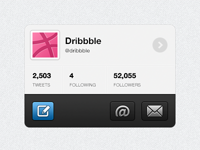
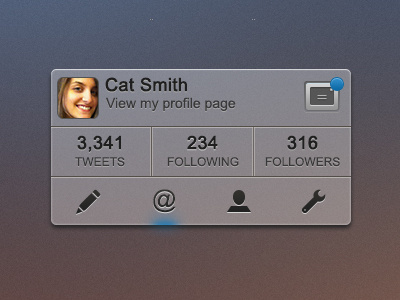
Twitter Rebound
Rich Vida
Follow
Following
Like
#EEEFF0
#282828
#A7A7A7
#596065
#F16397
#CA346C
#D5A5C4
#3686BE
Download color palette
Rebound of
Twitter Interface - Rebound this!
By
Cat Noone
Posted on Nov 27, 2012
400
0
19
5
View feedback
Rich Vida
More by Rich Vida
View profile
Previous
Next
Loading…