Find designers
Designer search
Quickly find your next designer
Post a job
The #1 job board for design talent
Inspiration
Courses
UX Diploma
Learn UX design from scratch in 6 months
UI Certificate
12-week UI skill building for designers
Live interactive workshops
with design professionals
Jobs
Go Pro
Log in
Dribbble: the community for graphic design
Log in
Sign up
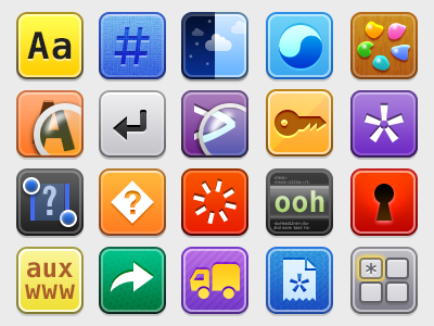
iOS Settings Icons
Panic
Follow
Following
Like
#E8E9EA
#3C4147
#F1BC42
#CB4813
#7173AB
#BDBDBC
#4EAADD
#4454BE
Download color palette
Neven made these 2x icons for the various "Settings" lists in our iOS apps. They're super fun to do.
Posted on Nov 27, 2012
3,487
4
109
8
View feedback
Panic
More by Panic
View profile
Previous
Next
Loading…