Find designers
Designer search
Quickly find your next designer
Post a job
The #1 job board for design talent
Inspiration
Courses
UX Diploma
Learn UX design from scratch in 6 months
UI Certificate
12-week UI skill building for designers
Live interactive workshops
with design professionals
Jobs
Go Pro
Log in
Dribbble: the community for graphic design
Advance your career with a Professional Diploma in UX Design
Learn more
Log in
Sign up
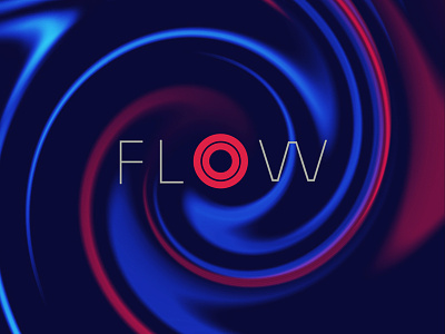
Flow
Jason Benjamin
Follow
Following
Like
#0D0A38
#4F1140
#1526A1
#2247CB
#BE1946
#4F9ED4
Download color palette
Branding project for school
abstract
colors
flow
ink
swirl
water
View all tags
Posted on Nov 26, 2012
1,777
1
18
2
View feedback
Jason Benjamin
More by Jason Benjamin
View profile
Previous
Next
Loading…