Find designers
Designer search
Quickly find your next designer
Post a job
The #1 job board for design talent
Inspiration
Courses
UX Diploma
Learn UX design from scratch in 6 months
UI Certificate
12-week UI skill building for designers
Live interactive workshops
with design professionals
Jobs
Go Pro
Log in
Dribbble: the community for graphic design
Log in
Sign up
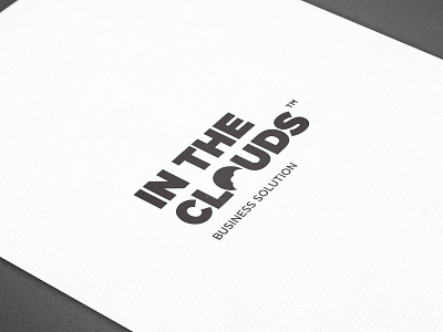
In The Clouds Business Solution Logo
Wigwham Perception Labs
Available for work
Follow
Following
Like
Get in touch
#FCFCFC
#565555
#807D7E
#C1BEBF
#A09E9F
Download color palette
brand
branding
cloud
corporate identity
identity
logo
logotype
negative space
View all tags
Posted on Nov 25, 2012
3,748
16
112
10
View feedback
Wigwham Perception Labs
Global First Design
Get in touch
More by Wigwham Perception Labs
View profile
Previous
Next
Loading…
Loading…
Loading…