Only one thing i would change is the text over the photo.
Because you putted it on 2 black transparant reqtengles my first thought was that there where 2 individual sentences, but actually there's one! But other than that i realy love the clean look of it dude!
I agree with Maxwell. Feels very generic. Could be swapped out and work for any product/service really. What really lacks in this for me is an emphasis on past/current work.
Nice. i would remove the blur from the image ( that imagery is nice, so why hide it). I would still work on the nav(too much negative space don't you think?). Overall, its simple, clean and direct.
Agree with @Maxwell Barvian@3magine It looks damn plan and looks like some standard wordpress theme... You should work on the content and header part a bit and try to add some visual stuff.. Clean doesnt mean to leave the page without adding any life :p :)
15 Responses
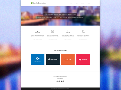
Working on a agency websites, still in early stage. Feedback would be appreciated!!
7 months ago
minimal
7 months ago
The icon for 'Design' isn't symmetrical. Everything else is super clean.
7 months ago
Perfect!
7 months ago
Very clean... I like the look.
But maybe decrease space between line and "some our recent work"?
7 months ago
supernice dude!
Only one thing i would change is the text over the photo.
Because you putted it on 2 black transparant reqtengles my first thought was that there where 2 individual sentences, but actually there's one! But other than that i realy love the clean look of it dude!
Keep it up!
7 months ago
Clean! Really nice!
7 months ago
Awesome.
7 months ago
Great!
7 months ago
Spacements are "a bit" exagerated. :P
7 months ago
It looks nice but it feels very generic to me. If you changed the logo this could essentially be any agency's website, IMO.
Just my 2 cents!
7 months ago
I agree with Maxwell. Feels very generic. Could be swapped out and work for any product/service really. What really lacks in this for me is an emphasis on past/current work.
7 months ago
Layout is a bit common but it's nice anyway!
7 months ago
Nice. i would remove the blur from the image ( that imagery is nice, so why hide it). I would still work on the nav(too much negative space don't you think?). Overall, its simple, clean and direct.
7 months ago
Agree with @Maxwell Barvian @3magine It looks damn plan and looks like some standard wordpress theme... You should work on the content and header part a bit and try to add some visual stuff.. Clean doesnt mean to leave the page without adding any life :p :)
6 months ago