Find designers
Designer search
Quickly find your next designer
Post a job
The #1 job board for design talent
Inspiration
Courses
UX Diploma
Learn UX design from scratch in 6 months
UI Certificate
12-week UI skill building for designers
Live interactive workshops
with design professionals
Jobs
Go Pro
Log in
Dribbble: the community for graphic design
Advance your career with a Professional Diploma in UX Design
Learn more
Log in
Sign up
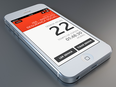
w8 - Ticket
Hugo França
Available for work
Follow
Following
Like
Get in touch
#5A5E63
#E8EAEC
#92908E
#BCC0C9
#272628
#E54327
Download color palette
Codebits Project 377 Members:
@Neuza Neves
, Rui Barroca e Marco Silva.
codebits
ios
loja do cidadão
mobile
pt
ticket
w8
View all tags
Posted on Nov 21, 2012
5,603
24
171
15
View feedback
Hugo França
Product Designer
Get in touch
More by Hugo França
View profile
Previous
Next
Loading…
Loading…
Loading…