Fair point... the news feed shadow is definitely extraneous and the background could be a little more subtle. On the device it's not extremely noticeable
I just gave it another look, you could try use a solid background (so the pattern lines don't intersect with the information blocks) and on a lighter tone to give a bit more contrast between the bg and the info blocks.
I would also try a super subtle pattern on the action bar.
Other than that the information architecture is very clever.
5 Responses
Pro
Roman Nurik
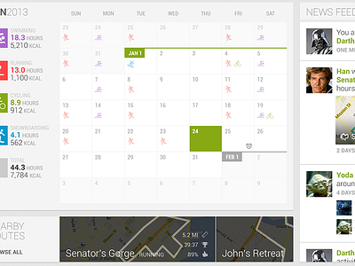
What could Endomondo look like on tablets? Watch Android Design in Action: Fitness Apps and Modern UIs for ideas :-)
6 months ago
Love it!
6 months ago
Something looks a bit too busy, might be the bg pattern and the inner shadow of the News Feed its too strong
6 months ago
Pro
Roman Nurik
Fair point... the news feed shadow is definitely extraneous and the background could be a little more subtle. On the device it's not extremely noticeable
6 months ago
I just gave it another look, you could try use a solid background (so the pattern lines don't intersect with the information blocks) and on a lighter tone to give a bit more contrast between the bg and the info blocks.
I would also try a super subtle pattern on the action bar.
Other than that the information architecture is very clever.
6 months ago