


Map pins - heart


Hey guys, long time no shoot :)
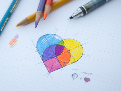
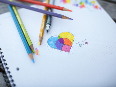
Here's a quick logo mark sketch I just did for an app that will allow you to see where your loved ones are at (targeting family & close friends).
With that in mind I thought it would be cool to have colorful map pins overlapping each other in perhaps an overlay blending mode to create a heart shape. This is one of the first rough steps of the process where you can see some geometry and get an idea of the color palettes that will be used. Any ideas, suggestions, comments are highly appreciated. :)
Larger and wider photo is attached.


