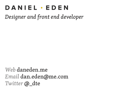
New Card - Take 2

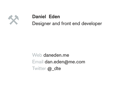
Trying again. This time, sticking to the sans-serif and blue-gray of the current cards. You can't see it here, but there's a crazy compound grid keeping everything tightly aligned.
Set in Basic Commercial, because it's the most beautiful typeface the print world has to offer. Tried to stick to one weight, but fell for one size instead.