Verizon

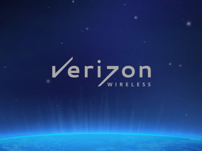
Mobile communication providers meet a lot of restrictions when it comes to logo areas in application. The smaller logo the better so I always thought that Verizon could do a fusion between the mark and the logotype. Here it's the same element used for both V and Z letters.