Find designers
Designer search
Quickly find your next designer
Post a job
The #1 job board for design talent
Inspiration
Courses
UX Diploma
Learn UX design from scratch in 6 months
UI Certificate
12-week UI skill building for designers
Live interactive workshops
with design professionals
Jobs
Go Pro
Log in
Dribbble: the community for graphic design
Advance your career with a Professional Diploma in UX Design
Learn more
Log in
Sign up
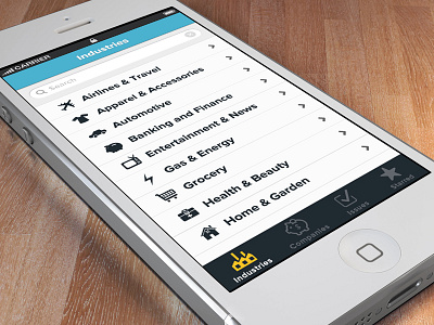
Industries Screen
Jeremy Mansfield
Available for work
Follow
Following
Like
Get in touch
#ECECED
#966B56
#464342
#A79C95
#89573D
#56A5BC
#AE8870
#D09969
Download color palette
First main menu screen.
Made with Brand Aid
2ndvote
2v
app
brand aid
branding
geomicons
icons
iconsweets
ios
iphone
mobile
retina
white
View all tags
Posted on Nov 15, 2012
964
2
17
4
View feedback
Jeremy Mansfield
Craftsman of beautifully branded user experiences.
Get in touch
More by Jeremy Mansfield
View profile
Previous
Next
Loading…
Loading…
Loading…