Find designers
Designer search
Quickly find your next designer
Post a job
The #1 job board for design talent
Inspiration
Courses
UX Diploma
Learn UX design from scratch in 6 months
UI Certificate
12-week UI skill building for designers
Live interactive workshops
with design professionals
Jobs
Go Pro
Log in
Dribbble: the community for graphic design
Log in
Sign up
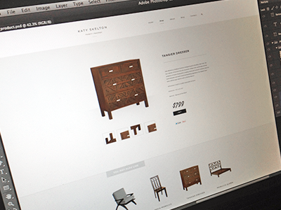
Product Detail
Bill Kenney
for
Focus Lab
Available for work
Follow
Following
Like
Get in touch
#EBEBE9
#B1A79B
#5E4C43
#262322
#8B6A59
Download color palette
Still super early, content, sizing and alignment is not final.
Created with the Focus Lab team
clean
design
experience
focus lab
furniture
simple
skelton
web design
View all tags
Posted on Nov 15, 2012
12,292
46
246
24
View feedback
Focus Lab
Be the brand that customers want and competitors envy.
Get in touch
More by Focus Lab
View profile
Previous
Next
Loading…
Loading…
Loading…