Find designers
Designer search
Quickly find your next designer
Post a job
The #1 job board for design talent
Inspiration
Courses
UX Diploma
Learn UX design from scratch in 6 months
UI Certificate
12-week UI skill building for designers
Live interactive workshops
with design professionals
Jobs
Go Pro
Log in
Dribbble: the community for graphic design
Log in
Sign up
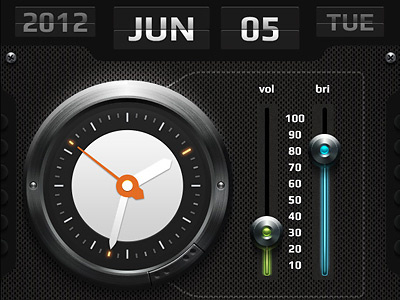
One little project
Borodox
Follow
Following
Like
#1B1B1A
#374944
#E5E5E5
#9E9F9E
#609C94
#DE671F
#BEDFCE
Download color palette
app
iphone
metal
View all tags
Posted on Nov 14, 2012
917
1
34
6
View feedback
Borodox
More by Borodox
View profile
Previous
Next
Loading…