Global (Re)Brands Playoff

Inspired by @Mads Burcharth and his concept of the Illy re-brand, I'm starting this playoff of the big global brands logo redesign. Pick any of those brands whose logo is 'bothering' you for some reason and show us what would you do to make it 'sexier'. I'm sure those companies won't be mad at us, it's just a little game of brainstorming and showing off :)
Special VIP invitation goes to @Norman Chan who I owe a playoff game ( http://dribbble.com/shots/685718-OUTATIME/rebounds ) so bud, get your guns in line and show me whutcha got!
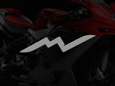
I am starting off with Italian superbike maker, the popular MV Agusta. For those who do not know about it, I can say that it's a Lamborghini of the motorbike world, simple as that. Their logo has been bothering me for some time now and you can see it here www.mvagusta.it along with their products. I simply think that those bikes deserve a much hotter image so here's my concept: MV monogram formed as a heart beat with 'blades' at both sides that show their ability to fight the severe Japanese competition :)
I invite every single logo designer here on Dribbble to join us, so peeps, knock yaself out! Have fun!


