Find designers
Designer search
Quickly find your next designer
Post a job
The #1 job board for design talent
Inspiration
Courses
UX Diploma
Learn UX design from scratch in 6 months
UI Certificate
12-week UI skill building for designers
Live interactive workshops
with design professionals
Jobs
Go Pro
Log in
Dribbble: the community for graphic design
Advance your career with a Professional Diploma in UX Design
Learn more
Log in
Sign up
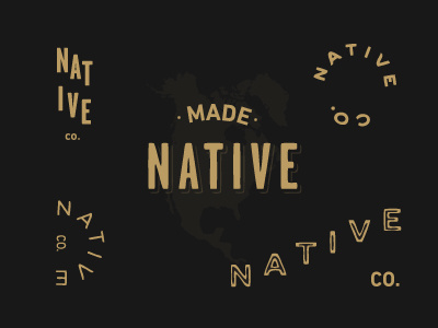
Native - Exploration
Alex Penny
Available for work
Follow
Following
Like
Get in touch
#191918
#B99B62
#433B2C
#90794F
#726143
#605339
Download color palette
Starting a company
madenative.co
. Experimenting with logo type with
Griffin
11
View all tags
Posted on Nov 13, 2012
2,737
8
119
6
View feedback
Alex Penny
Get in touch
More by Alex Penny
View profile
Previous
Next
Loading…
Loading…
Loading…