New VI site (idea 1, detail 1)

D

5 Responses

  1. Pro Elliot Jay Stocks Elliot Jay Stocks

    So, because I am apparently a glutton for punishment, I started redesigning the Viewport Industries site this morning when I should've been doing numerous other things.

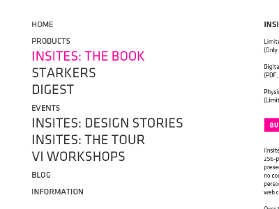
    The emphasis with the new design (if this makes it through (it’s only a very rough idea)) is to simplify absolutely everything and make it clear exactly what we do, highlighting our products and events. The nav in this sense is way more powerful than our ‘info’ page.

    This is not the actual size, by the way — the PSD is zoomed out.

    7 months ago

  2. Pro Haziq Mir Haziq Mir

    You still design in Photoshop?

    7 months ago

  3. Connor Gaughan Connor Gaughan

    If you're working through concepts why wouldn't you design in Photoshop? No sense in working out multiple concepts in the browser.

    I like the nav. Very prominent.

    likes

    7 months ago

  4. Stéphane Lambion Stéphane Lambion

    Pink? Nope.
    Blue? Yeah.

    7 months ago

  5. Pro Pete Lacey Pete Lacey

    Personally I feel there needs to be some more contrast in that navigation, things bleed together just a lil' too much for me.

    6 months ago

keyboard shortcuts: previous shot next shot L or F like