I would say number one is your best hover state, this feels more intuitive and clear for users. Digging the simplicity but I do agree it feels like there is something missing.
@Daykiine ⟁ I understand. We are going after simplicity but it could feel empty. This is still early so there may be some additions of possible color etc that will help bring it up a notch.
First seems like an overstep to the tone you are have set forward in the header + footer. Too many elements.
Second is not enough. The furniture doesn't form a straight "baseline" for that hover element to play nicely with. It's incongruent with the other hover element uses like in the nav where the text forms a straight line.
@Bill S Kenney seeing it from a consumer stand point and keeping line with Don't Make Me Think, though I love the simplicity (which is my style as well) I think maybe putting the price for each item would help a little in providing more information without cluttering it up too much. I would find it inconvenient to half to click on each item to see the price. It really doesn't need anything else besides that, clicking on the item itself will take you to a page to see more info and add to cart anyway.
Great as always, I think if the objects had some shadows like the armchair on the last row (if possible of course), maybe it could look even better, or a 1px grey line under each object, dunno, just brainstorming ;)
Working primarily on e-commerce stuff myself, I do think that there needs to be more information presented to the visitor. AT LEAST a name of the product should be there and I don't think it would take away from the simplicity of the design. Although, I do agree with most that it looks like something is missing, I feel like if the wireframe was right next to this I wouldn't really see a difference.
#1 would make the viewer rollover and then try to click the "+" when they could simply just rollover anywhere on the image and click.
#2 can present a problem if a client uploads an image that isn't perfectly formatted. It'd be awkward to see a line with an image that isn't centered or ill proportioned. While you may run into this same thing with #3, you at least have a box that a user will know to click within. A user may not know if they are supposed to click the line or the photo in option #2.
While we're on it, the content looks misplaced when you scroll to the footer. For example, "Made in Brklyn" sits quite a bit to the left of the TV cabinet above it, but the chair icon sits square to the left of the left side of that bedframe.
I understand the reason why this would happen, and I understand that all of those images are directly proportionate to each other, but it doesn't look as uniform as it should, in my opinion. I suppose one way to avoid this would be to add borders around the images or throw the images over a lighter shade of grey boxes.
Just a thought. I don't know this design or the vision as intimately as you do. I do, however, love the direction. Keep it up!
3 for sure—1's like papa bear (too much), 2's like baby bear (not enough), but 3's juuust right. I think it would be interesting seeing the 1px black stroke as a 2px medium gray stroke.
I hope you don't put too much stock in the comments about this 'missing something'—restraint in an ecommerce site is totally rare. More importantly, it seems like that kind of restraint is totally in line with the brand messaging.
33 Responses (page 1 of 2)
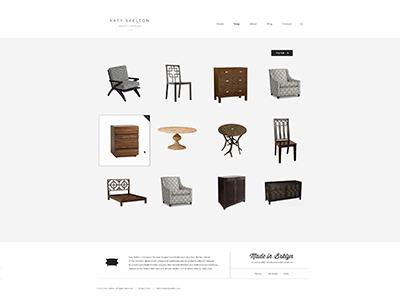
Again this is still super early but you can get a good idea of the tone we are trying to set with the new look.
Please see the attachments and pick a rollover state. DO IT :)
Created with the Focus Lab team
Note: some of this furniture is just place holder and not created by Katy Skelton.
7 months ago
Digging the simplicity here @Bill S Kenney. Good work.
7 months ago
Very empty :/
7 months ago
This kind of work is rarely simple. You're just doing a great job of making it look that way. Nice stuff!
7 months ago
Beautiful! I love how the products stand out the most, I do get the feeling of it being a little dull, maybe a dash of color?
7 months ago
Looks great. As @Roberto Ortiz said: Dig the simplicity. But one thing bugs me: http://cl.ly/KjVD – the line seems to be not pixel perfect :)
7 months ago
Oh my god this is incredible.
7 months ago
@Jesus We have a color that we can introduce I am struggling with the fact of taking away from the simplicity at the moment.
It will most likely find it's way in there :)
7 months ago
I would say number one is your best hover state, this feels more intuitive and clear for users. Digging the simplicity but I do agree it feels like there is something missing.
7 months ago
@Daykiine ⟁ I understand. We are going after simplicity but it could feel empty. This is still early so there may be some additions of possible color etc that will help bring it up a notch.
7 months ago
@Bill S Kenney I think a color can be introduced here, and it would still keep the simplicity and elegance.
7 months ago
I vote #2. The good ol' underline, everyone knows what it means. Plus it fits right in with what you are doing with the nav and logo.
I voted yesterday too.
7 months ago
Do 3.
First seems like an overstep to the tone you are have set forward in the header + footer. Too many elements.
Second is not enough. The furniture doesn't form a straight "baseline" for that hover element to play nicely with. It's incongruent with the other hover element uses like in the nav where the text forms a straight line.
Third is a good solution to this problem.
7 months ago
@Bill S Kenney seeing it from a consumer stand point and keeping line with Don't Make Me Think, though I love the simplicity (which is my style as well) I think maybe putting the price for each item would help a little in providing more information without cluttering it up too much. I would find it inconvenient to half to click on each item to see the price. It really doesn't need anything else besides that, clicking on the item itself will take you to a page to see more info and add to cart anyway.
7 months ago
Great as always, I think if the objects had some shadows like the armchair on the last row (if possible of course), maybe it could look even better, or a 1px grey line under each object, dunno, just brainstorming ;)
anyway, I really like your work on this project!
7 months ago
Working primarily on e-commerce stuff myself, I do think that there needs to be more information presented to the visitor. AT LEAST a name of the product should be there and I don't think it would take away from the simplicity of the design. Although, I do agree with most that it looks like something is missing, I feel like if the wireframe was right next to this I wouldn't really see a difference.
7 months ago
first one!
7 months ago
Number 2 for sure my man :) missing there any graphical elements behind them, like some pattern or some shapes, it's little lazy now :)
7 months ago
I think #3 would serve the user best.
#1 would make the viewer rollover and then try to click the "+" when they could simply just rollover anywhere on the image and click.
#2 can present a problem if a client uploads an image that isn't perfectly formatted. It'd be awkward to see a line with an image that isn't centered or ill proportioned. While you may run into this same thing with #3, you at least have a box that a user will know to click within. A user may not know if they are supposed to click the line or the photo in option #2.
7 months ago
While we're on it, the content looks misplaced when you scroll to the footer. For example, "Made in Brklyn" sits quite a bit to the left of the TV cabinet above it, but the chair icon sits square to the left of the left side of that bedframe.
I understand the reason why this would happen, and I understand that all of those images are directly proportionate to each other, but it doesn't look as uniform as it should, in my opinion. I suppose one way to avoid this would be to add borders around the images or throw the images over a lighter shade of grey boxes.
Just a thought. I don't know this design or the vision as intimately as you do. I do, however, love the direction. Keep it up!
7 months ago
My only suggestions is to add a subtle dropshadow to each item to ground them, otherwise they feel lost.
7 months ago
#2 regains simplistic focus here. Possibly dim out the content not in focus on rollover for emphasis.
7 months ago
#2 is really cool, like that style :)
7 months ago
#1
7 months ago
3 for sure—1's like papa bear (too much), 2's like baby bear (not enough), but 3's juuust right. I think it would be interesting seeing the 1px black stroke as a 2px medium gray stroke.
I hope you don't put too much stock in the comments about this 'missing something'—restraint in an ecommerce site is totally rare. More importantly, it seems like that kind of restraint is totally in line with the brand messaging.
7 months ago