Find designers
Designer search
Quickly find your next designer
Post a job
The #1 job board for design talent
Inspiration
Courses
UX Diploma
Learn UX design from scratch in 6 months
UI Certificate
12-week UI skill building for designers
Live interactive workshops
with design professionals
Jobs
Go Pro
Log in
Dribbble: the community for graphic design
Advance your career with a Professional Diploma in UX Design
Learn more
Log in
Sign up
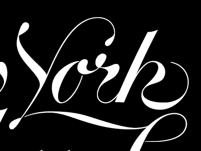
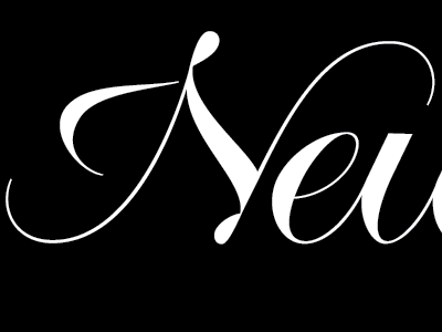
'York!
Thomas Jockin
Follow
Following
Like
#000000
#FDFDFD
#5A5C5E
#BBBDC0
#939598
Download color palette
Revisions on the lettering with the helpful comments by
@Lila Symons
Rebound of
New York
By
Thomas Jockin
lettering
script
View all tags
Posted on Nov 6, 2012
285
1
10
2
View feedback
Thomas Jockin
More by Thomas Jockin
View profile
Previous
Next
Loading…