Toolbar

1 Attachment

3 Responses

  1. Sam Potts Sam Potts

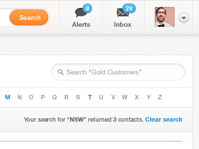
    A simpler nav for our site. Not completely sold on the blue badges but we're trying to use less orange. Check out the proper full view attached. It's still work in progress.

    8 months ago

  2. Michael Wong Michael Wong

    Love it. I feel like I've made that exact orange button before lol!

    One thing I'd point out is the blue notifications. It doesn't stand out enough on the page to catch your attention.

    Edit: Oh.. looking at ti again, maybe it does :P

    8 months ago

  3. Sam Potts Sam Potts

    Heh, well that's been our "button style" for a while. I just went fully rounded on the ends to match the classic "search" input.

    You're right though. There's something not right about the blue. I did a few variations; Red (iOS, Facebook etc), Orange (brand color), Green, Dark Blue (didn't look great) and that one. I'd prefer iOS as it's something people are used to.

    8 months ago

keyboard shortcuts: previous shot next shot L or F like