@Boldflower THX!
@Sergey Shapiro HA! love 'em works just fine, Sergey. I have the same problem coming up with words on your work, bud.
@Jonathan Adam Smith I wish it was, but no. just playing with it for now for something down the road. THX.
@Jeremy Pettis right on with the a's and e's, need some extra work there if I stay with this lock and type. thanks, man.
@J Fletcher Design, @Yana Makarevich , @Ryan Bosse , @Rich Scott and @Colin Stasuik thanks for the thumbs up.
@Alen Type08 Pavlovic nice option, Alen. Has possibilities there. :D
@Michael Spitz First one to catch the "J" horn reference (or at least the first to mention it) so I might just have to send you a jackalope head mount. (if I had one, that is.) :-)
thanks everyone.
Love this. Great shape. The thing that stands out to me are the antlers... I see it could be an upside down J, but I'm wondering what it could look like with more points?!
ooh nice!
little critique, i might tweak the shape of the top of the thigh, since most of the curves are more geometric (and I think the same line weight?)...
@Matt Borchert , @Florin Capota , @RaitG , @Type and Signs ,@Jeroen van Eerden and @Jeremiah Wingett thanks for the nice words enjoyed working on this one.
@Robyn Britt yeah I tried more points, looked nice but got a tad busy. thought I would just stay simple with that slightly hidden "J". THX for the feedback.
@Marissa Epstein thanks for the suggestion. the lines are all the same thickness, I just think I might have gotten a tad too close to the upper part of the back. We'll see where I go from here, thanks for taking the time to comment. Appreciate it. Cheers.
27 Responses (page 1 of 2)
Pro
Mike Bruner
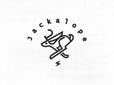
just having a little fun with that mystical, rabbit, the jackalope.
7 months ago
Love it!
7 months ago
Pro
Sergey Shapiro
Dang Mike, I love what you do, your marks are....can't find proper words...ok I LOVE 'EM!
7 months ago
please say it's to replace...http://jackalopebar.com/
7 months ago
love the proportion of the head/ears! a's & e looking a little tight
7 months ago
Pro
J Fletcher Design
So sweet.
7 months ago
nice style
7 months ago
Pro
Ryan Bosse
gotta love a jackalope
7 months ago
Pro
Rich Scott
so good man! Loving it
7 months ago
Love this, awesome job!
7 months ago
Pro
Alen Type08 Pavlovic
If Jackalope is already 'taken' it could pass as 'Jackaroo' to ;)
7 months ago
Pro
Michael Spitz
Great looking mark Mike. 'J' for the horns is a nice touch.
7 months ago
Pro
Mike Bruner
@Boldflower THX!
@Sergey Shapiro HA! love 'em works just fine, Sergey. I have the same problem coming up with words on your work, bud.
@Jonathan Adam Smith I wish it was, but no. just playing with it for now for something down the road. THX.
@Jeremy Pettis right on with the a's and e's, need some extra work there if I stay with this lock and type. thanks, man.
@J Fletcher Design, @Yana Makarevich , @Ryan Bosse , @Rich Scott and @Colin Stasuik thanks for the thumbs up.
@Alen Type08 Pavlovic nice option, Alen. Has possibilities there. :D
@Michael Spitz First one to catch the "J" horn reference (or at least the first to mention it) so I might just have to send you a jackalope head mount. (if I had one, that is.) :-)
thanks everyone.
7 months ago
Really solid, love it!
7 months ago
Pro
Robyn Britt
Love this. Great shape. The thing that stands out to me are the antlers... I see it could be an upside down J, but I'm wondering what it could look like with more points?!
7 months ago
Pro
Florin Capota
ha, nice one Mike!
7 months ago
very good
7 months ago
Pro
TAS
amazing as always !
7 months ago
Pro
Jeroen van Eerden
Great one!
7 months ago
ooh nice!
little critique, i might tweak the shape of the top of the thigh, since most of the curves are more geometric (and I think the same line weight?)...
7 months ago
Pro
Jeremiah Wingett
The type and the illustration really work well together. Good work.
7 months ago
Pro
Mike Bruner
@Matt Borchert , @Florin Capota , @RaitG , @Type and Signs ,@Jeroen van Eerden and @Jeremiah Wingett thanks for the nice words enjoyed working on this one.
@Robyn Britt yeah I tried more points, looked nice but got a tad busy. thought I would just stay simple with that slightly hidden "J". THX for the feedback.
@Marissa Epstein thanks for the suggestion. the lines are all the same thickness, I just think I might have gotten a tad too close to the upper part of the back. We'll see where I go from here, thanks for taking the time to comment. Appreciate it. Cheers.
7 months ago
Pro
Salih Kucukaga
You can't go wrong with this layout. Great work.
7 months ago
Pro
David Cran
I shot one of these once - but it hopped away....
7 months ago
Pro
Jovan Petrić
This animal is fast.. wait.. I just woke up.. it's a dream :)
7 months ago