Mobile Navigation Overhaul for nols.edu

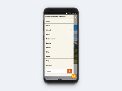


A few days ago I shared the desktop version of the nols.edu navigation. Here is the mobile version of the new navigation. The previous mobile navigation was clunky with several usability issues and technical bugs.
The goal of the new mobile navigation is to lead the user through a journey to discover each type of course offered at NOLS. In these mockups I take you through the journey to discover more about a NOLS Expedition course.
The simplicity lends itself to a mobile-first approach, improving usability for our growing audience across mobile devices. The new navigation is live and the team is beginning another round of usability testing with key target audiences.
👩My Role: Project Manager & User Experience Lead
🙌Shout-out to team members: Kristen Lovelace, Laura Griffee
💖 Press L to show some love


