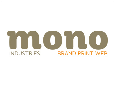
Possible new identity for my own design company.
I'm liking this but I'm struggling to work out the best way to centre the word 'industries' beneath the 'm' of 'mono'. This looks like it needs to move to the right a touch, even though it's actually centred between the left and right-hand down strokes of the 'm'.
Also, the order, from left to right, of the strap line: it's currently in alphabetical order but I wonder whether the words should appear in the order in which I do most of my work - Web Brand Print.
The colours I've used here are a simplified palette of my current identity which I'm still happy with. The identity will also need to appear on the green-ish background, in which case I'll use a black & white version and replace the orange for white.
All comments gratefully received. Thanks.


